Writing content
In Strapi, writing content consists in filling up fields, which are meant to contain specific content (e.g. text, numbers, media, etc.). These fields were configured for the collection or single type beforehand, through the Content-type Builder.

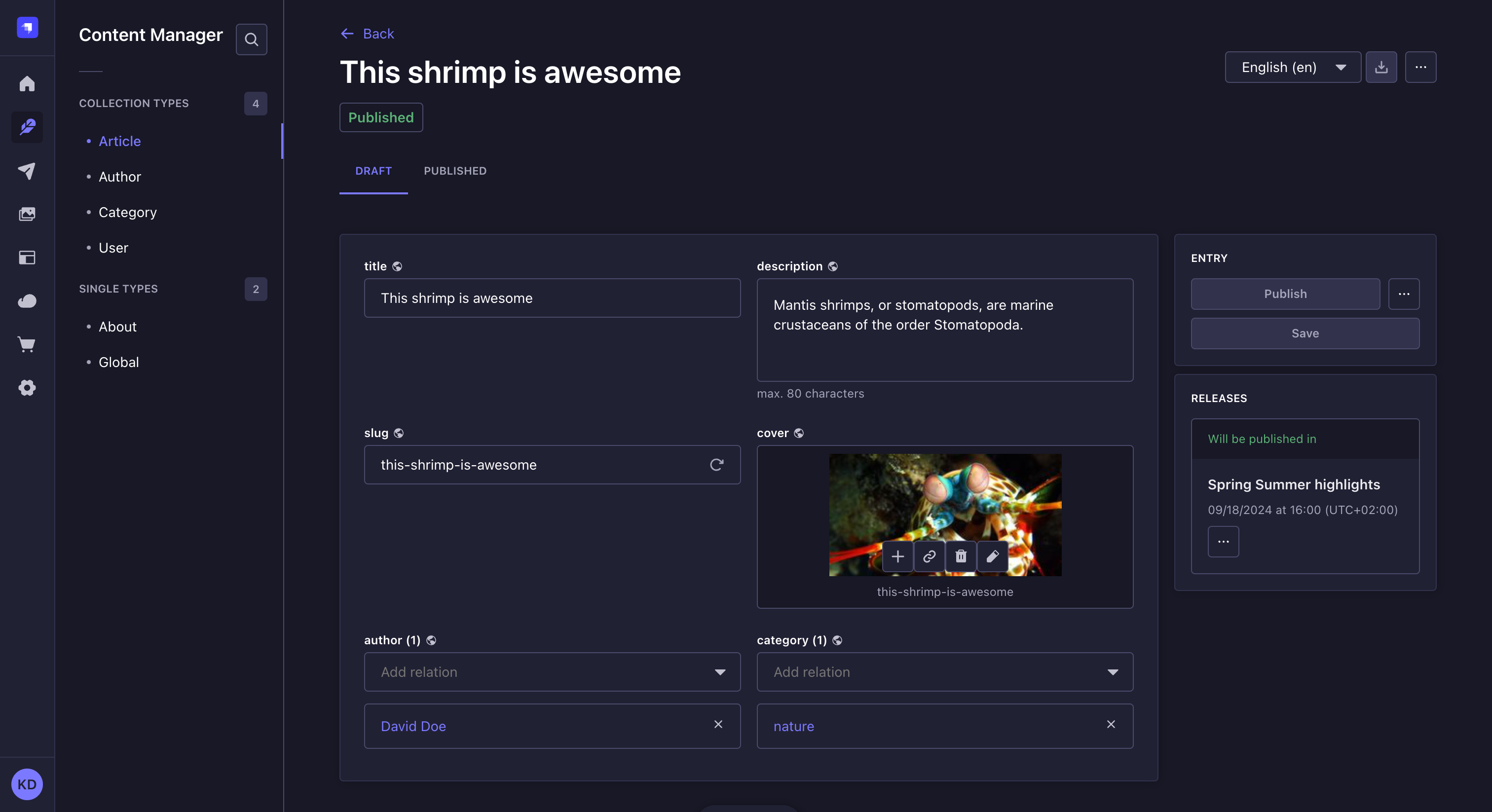
Filling up fields
To write or edit content:
- Access the edit view of your collection type or single type.
- Write your content, following the available field schema. You can refer to the table below for more information and instructions on how to fill up each field type.
If Draft & Publish is enabled for your content-type (it's enabled by default), the fields work the same way whether you are editing the draft or published version. See Saving, publishing, and deleting content for more information about the Draft & Publish feature.
| Field name | Instructions |
|---|---|
| Text | Write your content in the textbox. |
| Rich text (Markdown) | Write your textual content in the editor, in Markdown. Some basic formatting options (titles, bold, italics, underline) are available in the top bar of the editor to apply to selected text. A Preview mode/Markdown mode button to switch between modes is also available. 💡 The box can be expanded by clicking on Expand in the bottom bar. It displays side by side, at the same time, the textbox that you can edit and the preview. |
| Rich text (Blocks) | Write and manage your content in the editor, which automatically renders live all additions/updates. In the Blocks editor, paragraphs behave as blocks of text: hovering on a paragraph will display an icon on which to click to reorder the content. Options to format or enrich the content are also accessible from the top bar of the editor (basic formatting options, code, links, image etc.). 💡 You can use text formatting keyboard shortcuts in the Blocks editor (e.g. bold, italics, underline, and pasting link). |
| Number | Write your number in the textbox. Up and down arrows, displayed on the right of the box, allow to increase or decrease the current number indicated in the textbox. |
| Date | 1. Click the date and/or time box. 2. Type the date and time or choose a date using the calendar and/or a time from the list. The calendar view fully supports keyboard-based navigation. |
| Media | 1. Click the media area. 2. Choose an asset from the Media Library or from a folder if you created some, or click the Add more assets button to add a new file to the Media Library. 💡 It is possible to drag and drop the chosen file in the media area. |
| Relation | Choose an entry from the drop-down list. See Managing relational fields for more information. |
| Boolean | Click on TRUE or FALSE. |
| JSON | Write your content, in JSON format, in the code textbox. |
| Write a complete and valid email address. | |
| Password | Write a password. 💡 Click the icon, displayed on the right of the box, to show the password. |
| Enumeration | 1. Click the drop-down list. 2. Choose an entry from the list. |
| UID | Write a unique identifier in the textbox. A "Regenerate" button, displayed on the right of the box, allows automatically generating a UID based on the content type name. |
Filling out a custom field depends on the type of content handled by the field. Please refer to the dedicated documentation for each custom field hosted on the Marketplace.
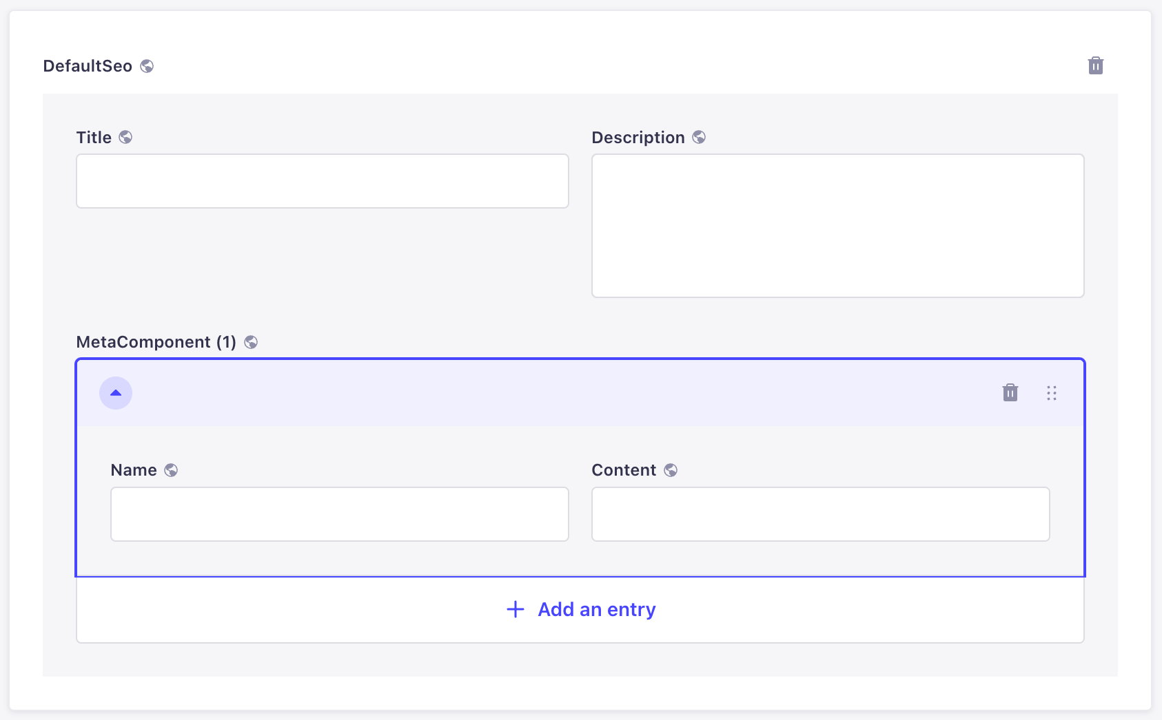
Components
Components are a combination of several fields, which are grouped together in the edit view. Writing their content works exactly like for independent fields, but there are some specificities to components.
There are 2 types of components: non-repeatable and repeatable components.
Non-repeatable components
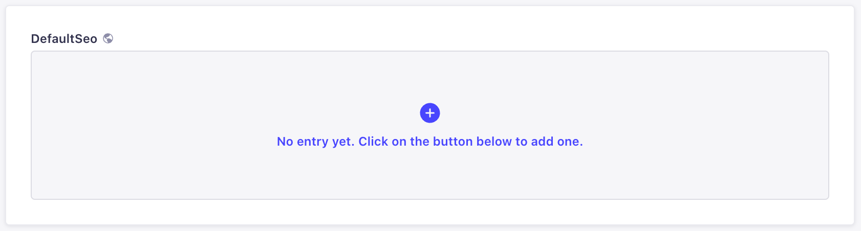
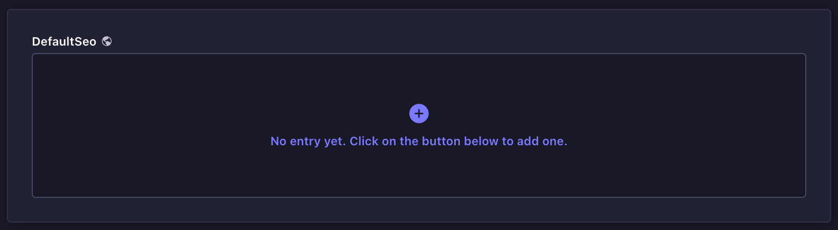
Non-repeatable components are a combination of fields that can be used only once.
By default, the combination of fields is not directly displayed in the edit view:
- Click on the add button to add the component.
- Fill in the fields of the component.
To delete the non-repeatable component, click on the delete button , located in the top right corner of the component area.
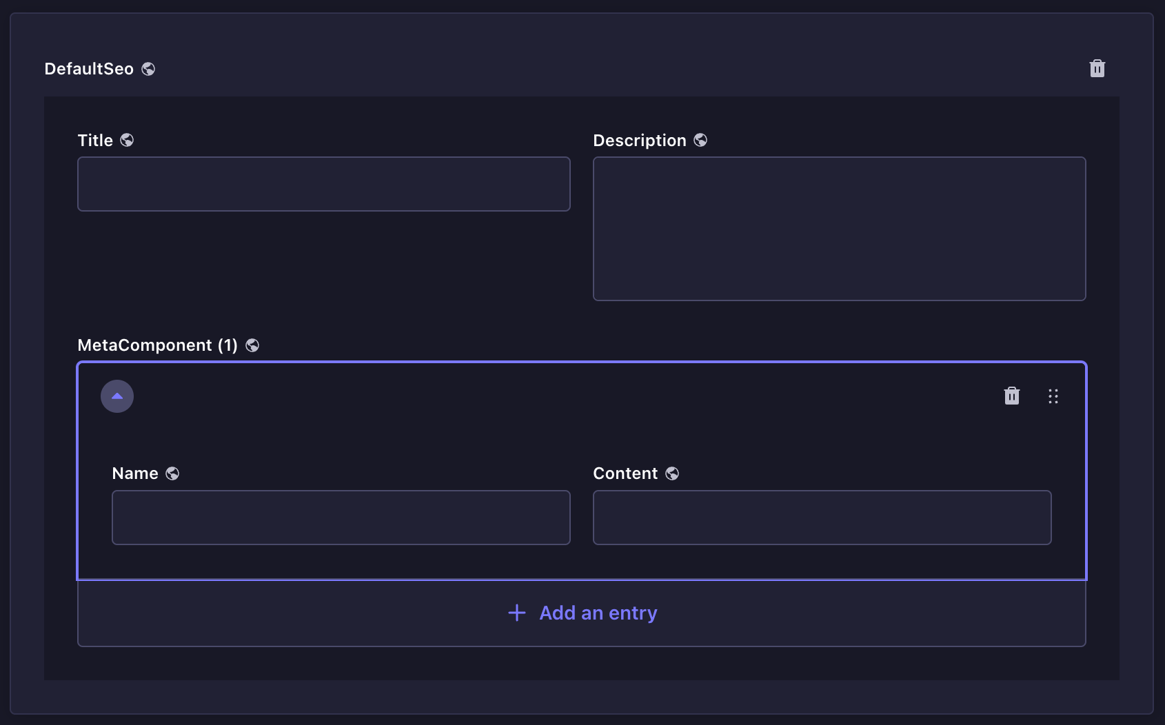
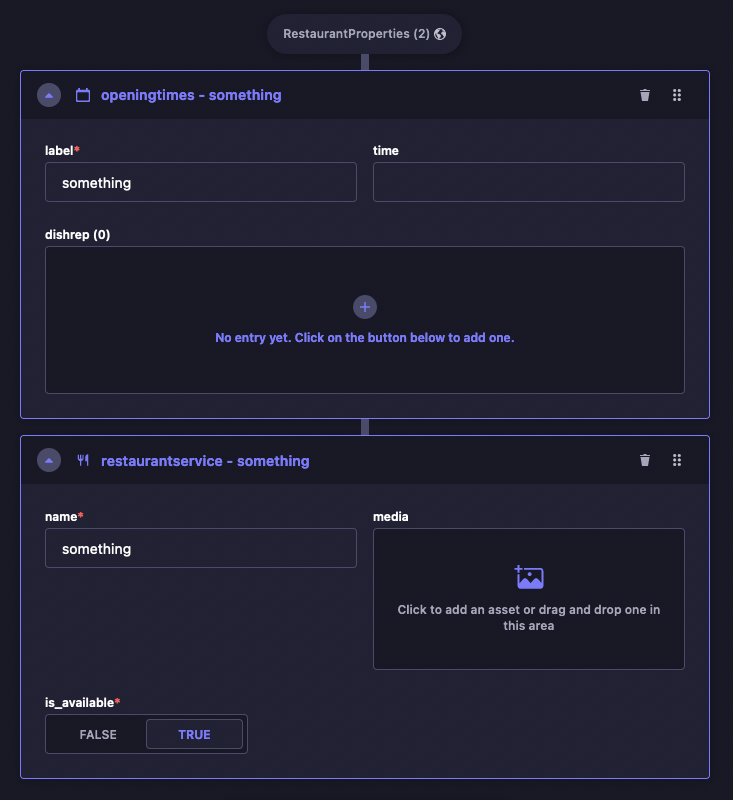
Repeatable components
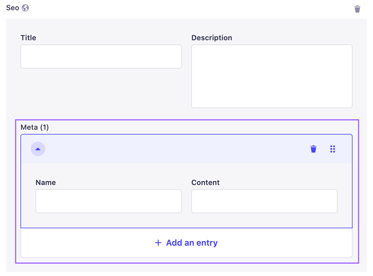
Repeatable components are also a combination of fields, but they allow the creation of multiple component entries, all following the same combination of fields.
To add a new entry and display its combination of fields:
- Click on the add button to add the component.
- Fill in the fields of the component.
- (optional) Click on the Add an entry button and fill in the fields again.
The repeatable component entries can be reordered or deleted directly in the edit view, using buttons displayed on the right of the entry area.
- Use the drag & drop button to reorder entries of your repeatable component.
- Use the delete button to delete an entry from your repeatable component.
Unlike regular fields, the order of the entries of a repeatable component is important. It should correspond exactly to how end users will read/see the content.
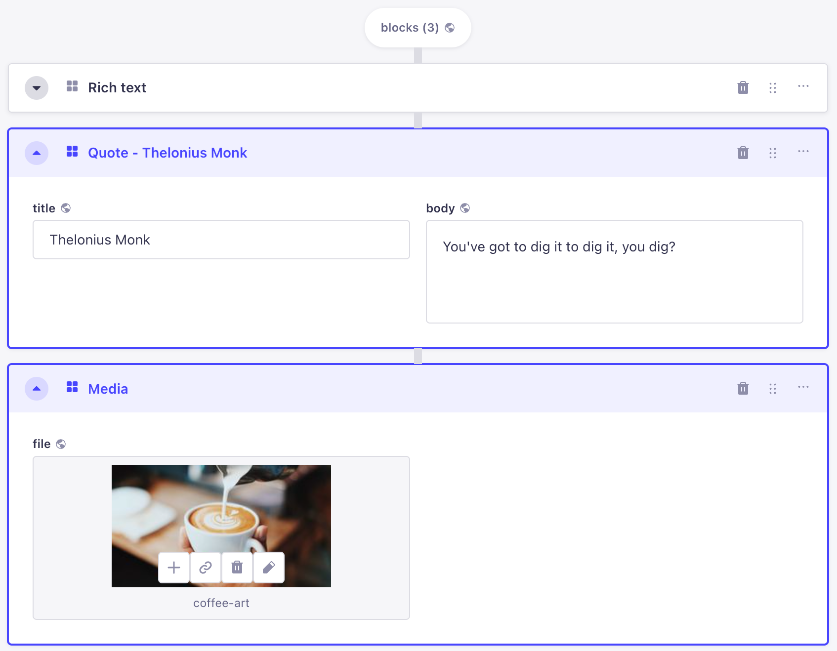
Dynamic zones
Dynamic zones are a combination of components, which themselves are composed of several fields. Writing the content of a dynamic zone requires additional steps in order to access the fields.
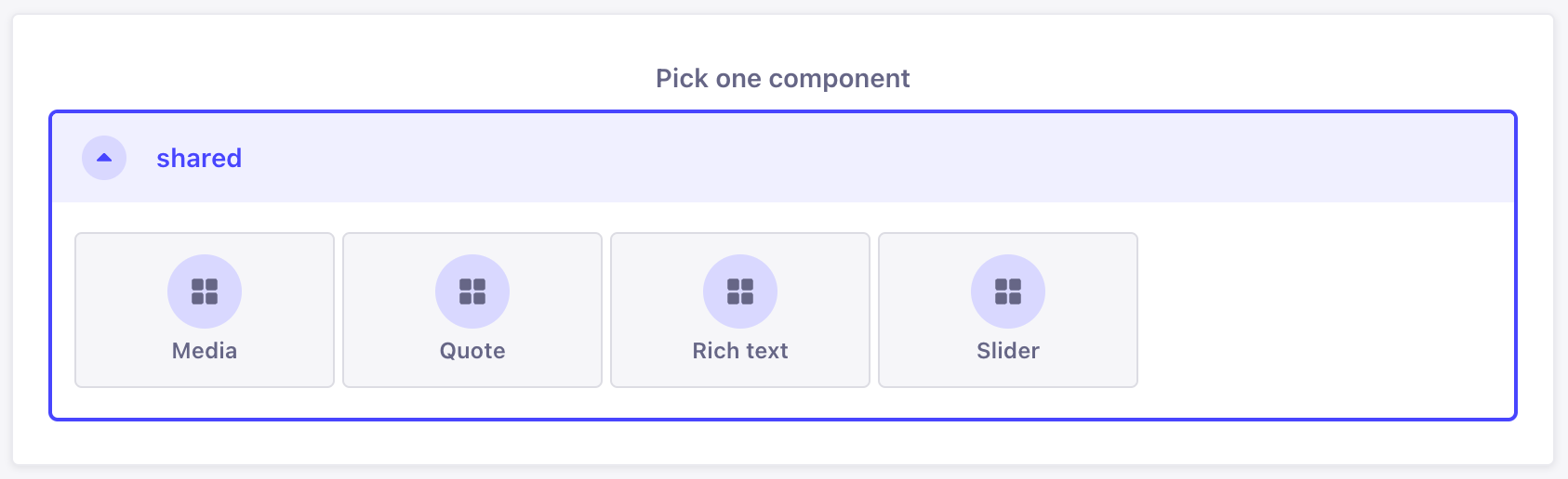
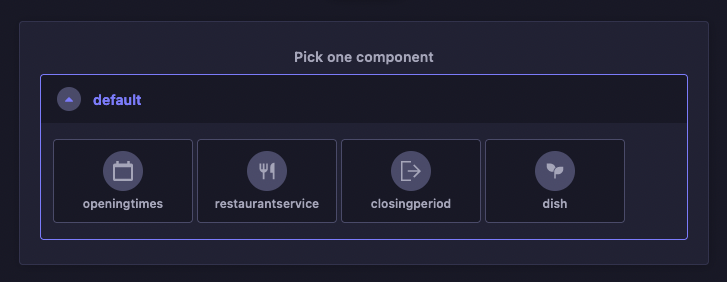
- Click on the Add a component to [dynamic zone name] button.
- Choose a component available for the dynamic zone.
- Fill in the fields of the component.
Dynamic zones' components can also be reordered or deleted directly in the edit view, using buttons displayed in the top right corner of the component area.
- Use the drag & drop button to reorder components in your dynamic zone.
- Use the delete button to delete a component from your dynamic zone.
You can also use the keyboard to reorder components: focus the component using Tab, press Space on the drag & drop button and use the arrow keys to then re-order, pressing Space again to drop the item.
Unlike regular fields, the order of the fields and components inside a dynamic field is important. It should correspond exactly to how end users will read/see the content.